| Last month I wrote about watching the gold and silver markets for a break through their support levels, yet by the time the article went to print it had all happened! I also left you with some questions about the ANZ Bank going sideways through March and April. In this article I plan to use it again to illustrate a concept I know many students struggle with when they start out with Price forecasting.
In the process of selecting better ABC trades, after shortlisting we then look at where the trade fits in the bigger picture for that market. This involves steps such as applying high, low and ranges resistance cards, as well as looking for ranges to repeat into the current level. During the application of all these techniques we need to be systematic, and also careful not to just cover our chart with lines that become meaningless clutter.
There was an ABC Long setup on ANZ recently with a nice gap from A to B, and point C on 2/5/13. Take a look at this in ProfitSource. Now, the fact that the A to B range was abnormally large should have stopped us investigating this any further, but using price forecasting techniques we could be on the alert for a potential change in trend and possible overbalance in price to the short side.
The key point here is to apply each technique separately to look for harmony through the history if the market, and to detect any current support or resistance. Take a look at Chart 1 where I have applied the Lows Resistance Card from 1998. Can you see how the market reacted to the 25%, 50%, 75% and 100% multiples on many occasions? The current May 1 high is also at a 100% multiple of the low.
Chart 1: ANZ with 1998 Lows Resistance Card
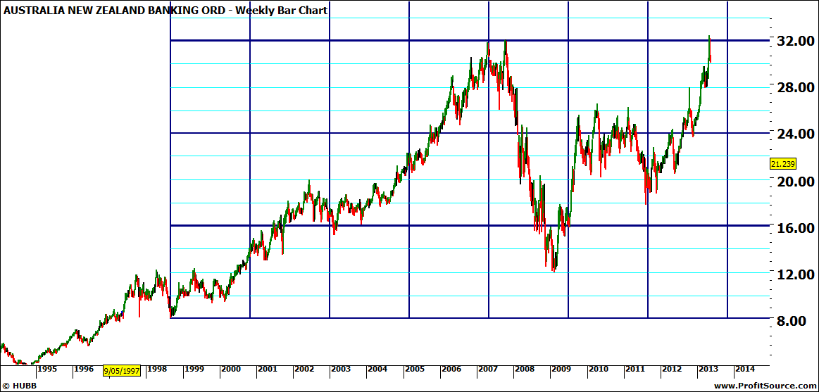
Click to Enlarge
That alone would not be significant price resistance at the current level, so the next step is to look for a cluster of price resistance, or price pressure points, utilising the other techniques mentioned above. In Chart 2 I am looking at ranges repeating, and you can see how the 09-10 range repeated to 100% from the 2011 low. Note that I have removed the lows resistance card before looking for the repeating ranges.
Chart 2: ANZ Weekly Bar Chart with Bull Ranges Repeating
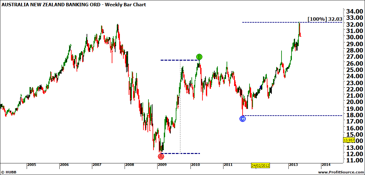
Click to Enlarge
Next, on a separate chart again, I have noted that there is an old top sitting around this level. This is the 2007 top which until last week was the All Time High for ANZ. Until the market pushes through this level and holds above it, in technical terms we are looking at a double top.
Chart 3: ANZ with Potential Double Tops
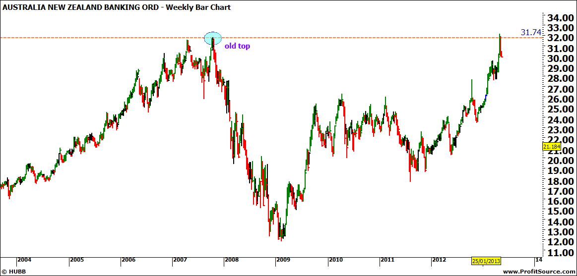
Click to Enlarge
Combining the three price pressure points from the above charts we can now say we have a cluster of price resistance around this $32 mark. I like to see at least three to call it a cluster. However, when there is harmony in a market on the big picture you should also see it on the small picture too. In Chart 4 I have shown on the daily chart how the First Range Out from August 2011 has repeated to 150% with the gap occurring over the 150% and then back again.
Chart 4: ANZ Daily Bar Chart with Ranges Repeating
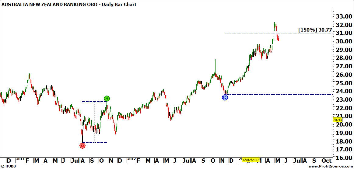
Click to Enlarge
This is the first daily bar chart I have shown and you might be interested to note the island reversal pattern that has formed. This was due to the stock going ex-dividend. It will be very interesting to see if this gap holds for a stronger pullback, or is closed again in the shorter term.
The main point I wish to make is that too many techniques applied all at once can hide the harmony and cloud your analysis. Yet applied one by one we can uncover clusters of price pressure which will aid our decision making, by looking for them to either support or oppose our trade.
This is the first daily bar chart I have shown and you might be interested to note the island reversal pattern that has formed. This was due to the stock going ex-dividend. It will be very interesting to see if this gap holds for a stronger pullback, or is closed again in the shorter term.
It’s The Journey
Lauren Jones |