
I have a list of futures that I regularly scroll through to feel the temperature of the global economy and I want to share some of these with you today.
I look at these charts normally in daily and weekly phases generally, but in this article, I will mostly use weekly as I am wishing to talk in broad terms about the calendar year 2018 and in some cases into 2019. I am not trying to pick a year end level but rather trends we might see develop.
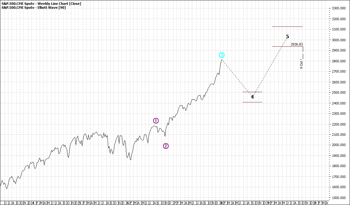
As per usual I will start with the USA market – still the leader by all standards in financial markets. And I will use the S&P which is the most representative of US markets, though the DOW gets the most headlines.
I will use my standard plain vanilla 90-day Elliott line chart.
Click to Enlarge
At first glance you might conclude the S&P has only another 10% to go – and you might proffer that is not a lot of movement. Mind you at a time when banks will barely give you 1% and other cash instruments might give you maybe up to 5% - with a commensurate increase of risk – maybe 10% is not too bad.
If you have good risk management in place.
However, if you are a medium-term player, or even a long term "accumulator" then 2018 could be a rewarding year.
The reason I say that is a pullback to 2500 for the S&P could be a smart ‘’buy in’’.
Could be – though we need to make that assessment when we get there. But a move from 2500 to 3000 is a gain of 20%. Now that is not bad at all.
Click to Enlarge
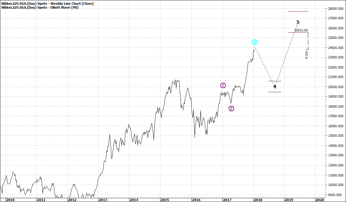
Now the Nikkei is not a large equity market and not one in which foreigners invest but Japan is still the third largest global economy and a healthy Japan is always encouraging.
Like many global equity markets, the Nikkei has had a solid 2017 and a strong run up since 2016 so a projected pullback is not surprising and in fact would be healthy and provide a logical basis for a run up over the next year or so.
The German DAX gives us an insight into the European outlook:

Click to Enlarge
We can see there is room for a further move higher – but nothing terribly exciting.
The Hang Seng is a proxy to some extent for the Chinese market. Again, a similar pattern to USA markets:

Click to Enlarge
A pullback and then a move higher. Reassuring.
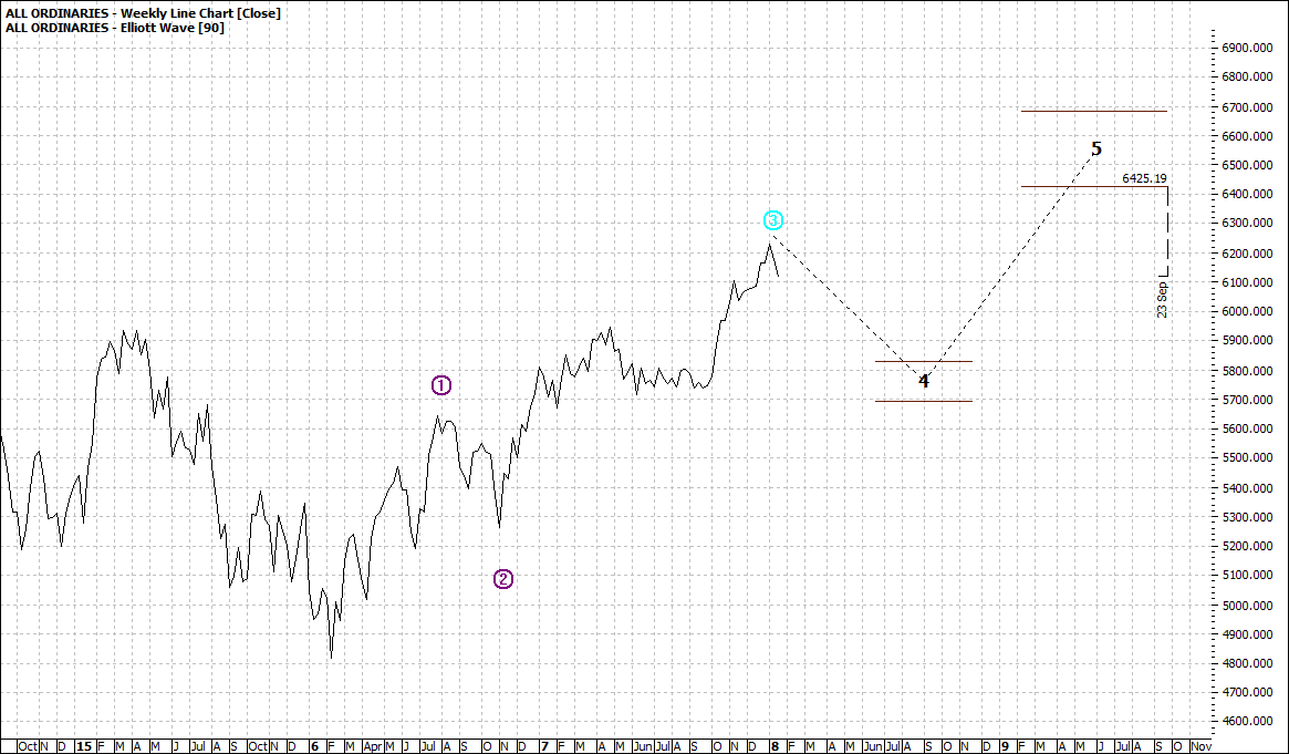
The overall market index for the Australian market shows also a similar pattern – a pullback and then a new high:
Click to Enlarge
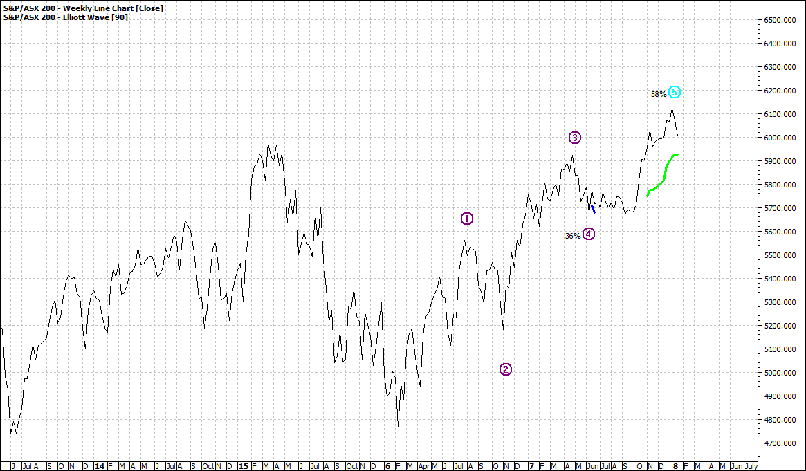
But the top 200 index shows a more conservative picture:
Click to Enlarge
Now I know many readers would debate this difference, but I am not perturbed about this as for the moment I am really focussed on the macro outlook.
Next week I will look at other financial market sectors such as commodities, bonds and currencies that might also guide us in the year ahead.
Enjoy the ride
Tom Scollon
|