I have long held the view that us mere mortals know little of what goes on behind the scenes in the world. We could spend time surmising or reading the words of the few good learned people amongst the world influencers; But I don’t have enough time to delve into this and I must follow a distilled approach.
When it comes to trading or investing, I have also long held the view that fake news or otherwise or whether we have a theoretical "perfect" insight into the truth matters little. Not for one moment am I suggesting one should be complacent to the madness in the world around us. I can easily separate the business end from the private end and care about each as separate exercises.
So, in my trading I don’t really contemplate what is happening in the socio-economic world, I spend my time focussing on the charts.
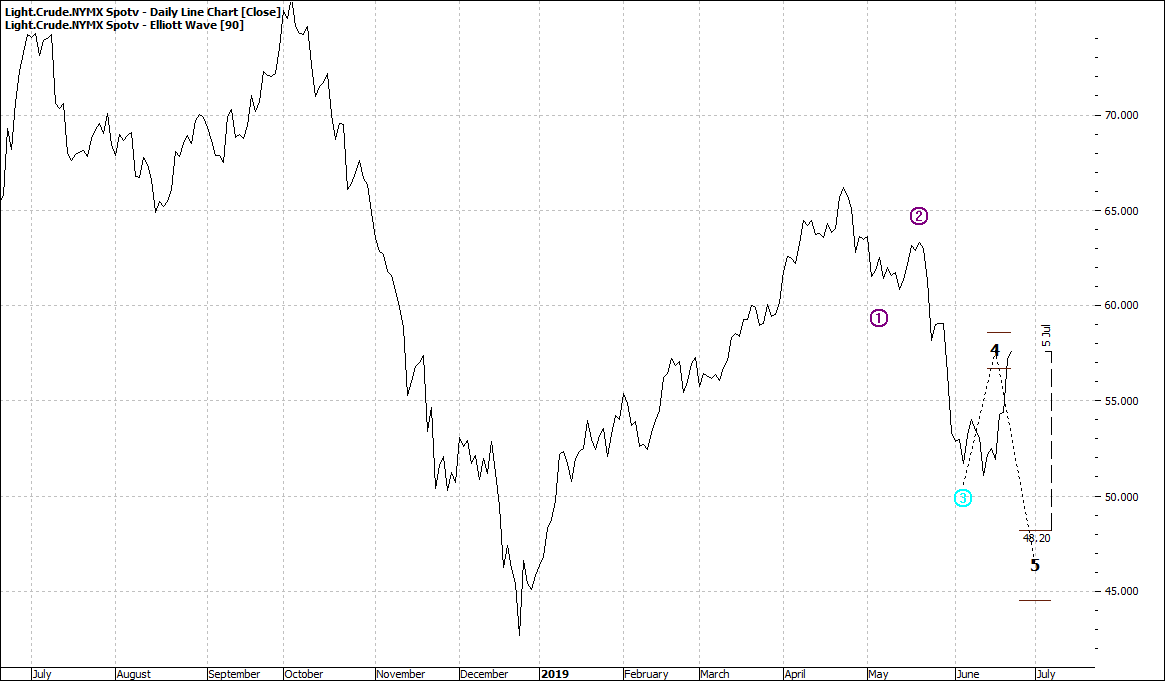
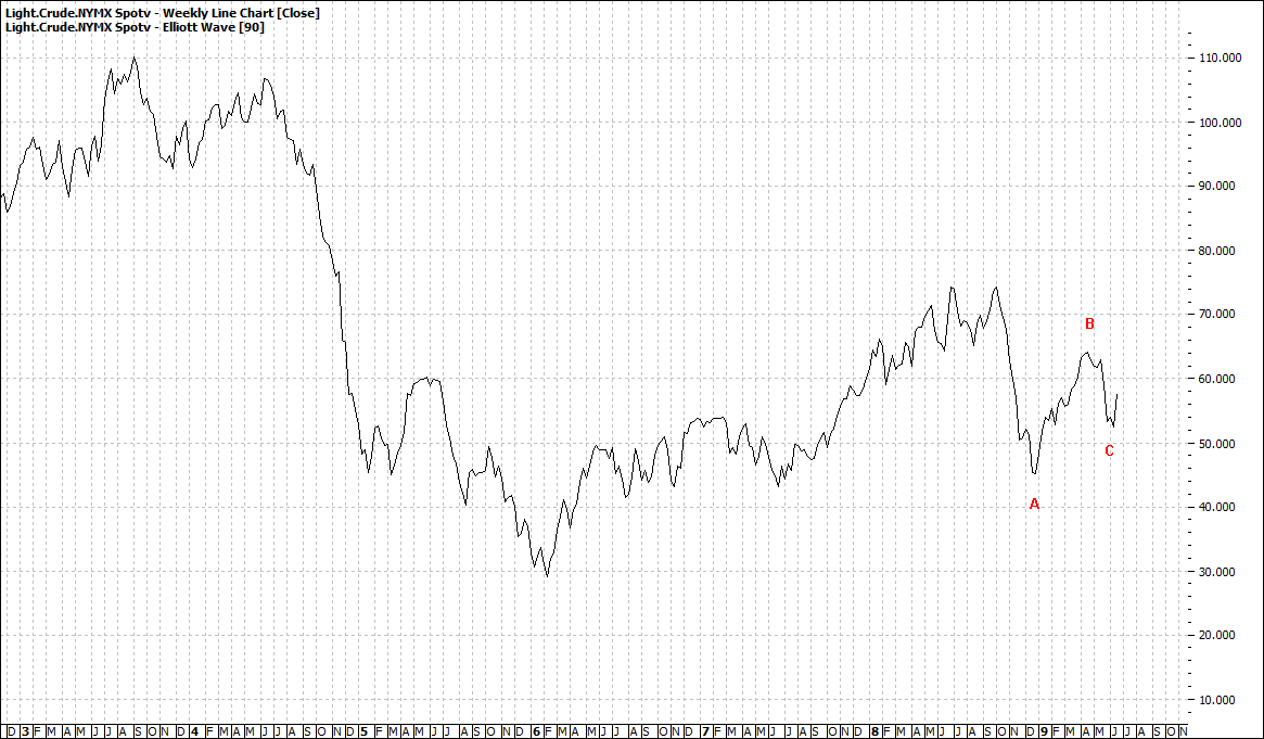
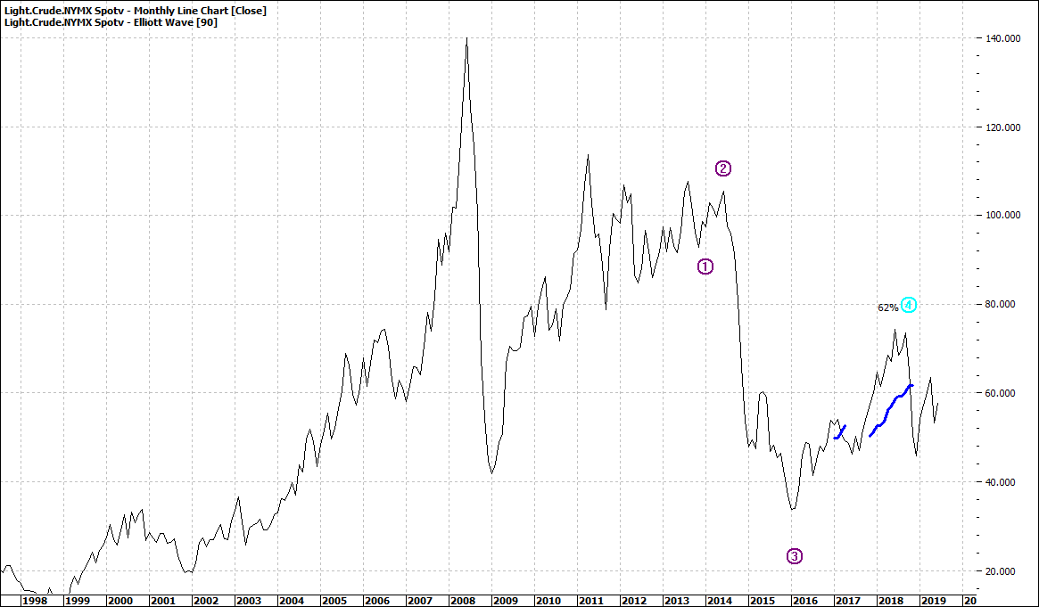
The above is a preamble to the incongruence between the media (I desperately need to sell advertising space and control opinion) headlines about ructions in the Middle East and what is seen in the charts. And I refer more particularly about the price of crude oil. This is always a soft hot button – well so would the media have you believe. But things have changed, and many analysts have not caught up with the reasons for the waning connection between war and oil. But media trot out the same old story about climbing oil prices.
Let’s look at the charts for light crude:
|
Light Crude (CL-Spotv:NYMX) - Daily Line Chart
|
|
|

Click to Enlarge
|
Light Crude (CL-Spotv:NYMX) - Weekly Line Chart
|
|
|

Click to Enlarge
|
Light Crude (CL-Spotv:NYMX) - Monthly Line Chart
|
|
|

Click to Enlarge
There is no war, no fear, no belief in media hype. Oil price is going nowhere for now.
Now I could write much about the why and how of the disconnect between instability in the Middle East and oil price but it would serve little purpose. It is all in the charts.
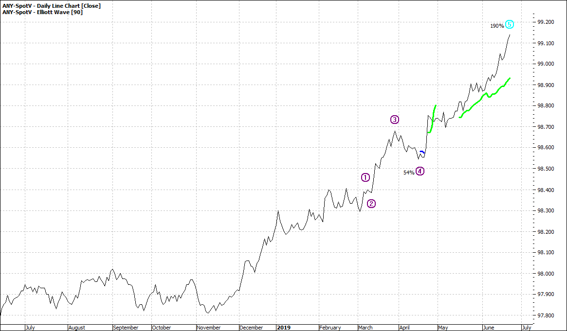
There is nothing wrong with the charts. If there was something dramatic in the charts we would see it. As we see in the bond price charts:
|
ASX 3 Year Bond (ANY-Spotv:SFE) - Daily Line Chart
|
|
|

Click to Enlarge
The chart reminds us what a trend looks like.
So light crude charts say the world is not taking seriously the war story right now no matter what foolery is going on or what hype the media would attempt to create.
Enjoy the ride
Tom Scollon
|