
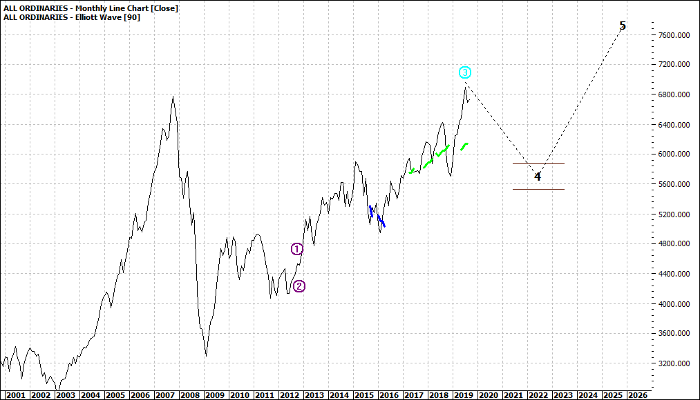
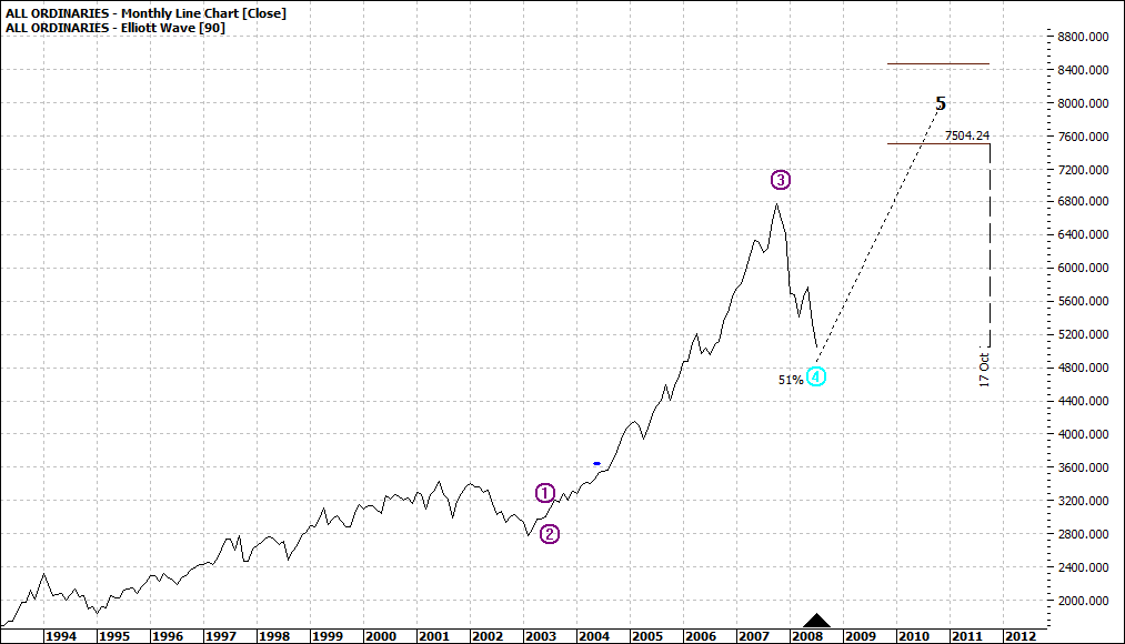
My first chart is the current monthly outlook for the All Ords and the second chart is just before the cliff experience back in 2007:
|
All Ordinaries (XAO:ASX): Monthly Line Chart
|
|
|
Click to Enlarge
|
All Ordinaries (XAO:ASX): Monthly Line Chart
|
|
|
Click to Enlarge
Now I do not claim that the two charts are the same but there are similarities.
I have experienced a number of sharemarket crashes and sort of - from experience - know the signals.
I recall well the 2007/08 crash as it does not seem that long ago. I started selling down late 2007 and was 100% in cash by January 2008. Not perfect timing but not too bad.
Let me refer
back to the first chart – the current. I use a monthly chart regularly
to provide me with a longer-term picture. But I use it with caution.
I
recall well back in 2007 the bullishness that pushed the market yet
higher and higher – even though the fundamentals and many eco-political
factors did not support continuing to pour money into the market.
It is "déjà vu" all over again.
So
why do people still continue to buy? There are numerous reasons for
that but simply, the market does not signal clearly when a cliff
experience is ahead. It is a bit like death.
We may know it is somewhere ahead but the exact moment, if we allow nature or destiny to take its course, we do not know.
So, markets may well climb yet further, but I am not so interested in getting that last buck out of the market.
I am happy to take the bulk out of the trend and sleep at night.
Enjoy the ride
Tom Scollon
|